 English
 Español
 日本語
日本語 عربى
عربى русский
-
PVC Picture Frame
Sold by brand JinHuan

-
PVC Moulding
Sold by brand JinHuan

-
MDF Picture Frame
Sold by brand JinHuan

-
Iron Photo Frame
Sold by brand JinHuan

-
Plastic Injection Frame
Sold by brand JinHuan

-
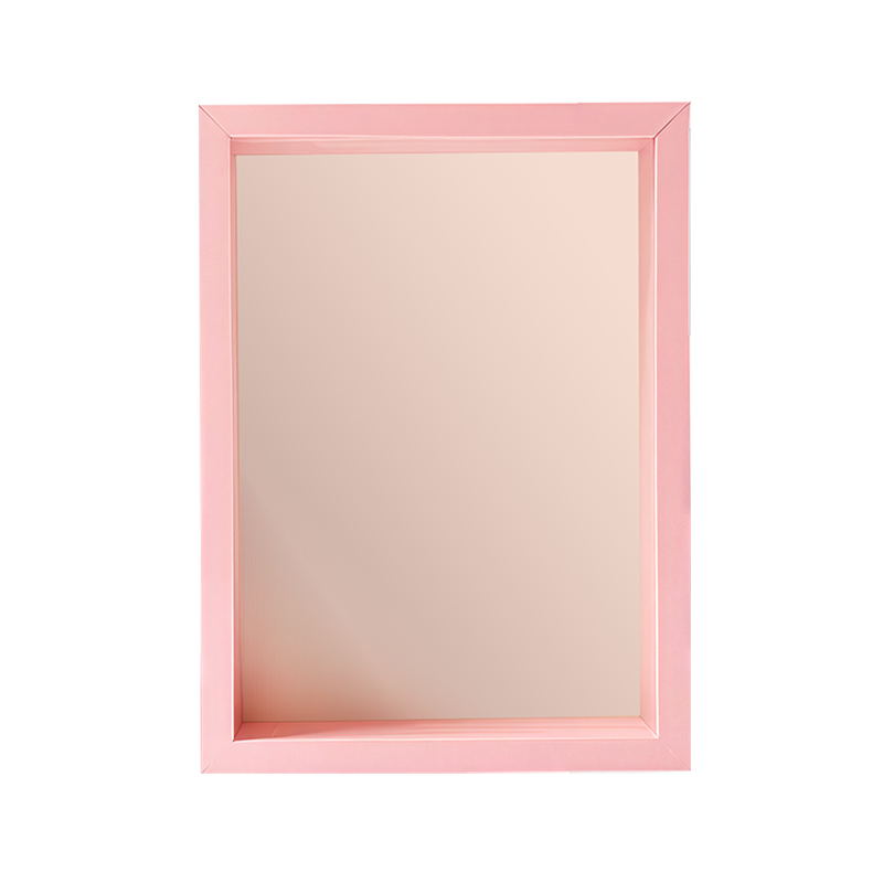
Mirror
Sold by brand JinHuan

-
Glass Picture Frame
Sold by brand JinHuan

-
PS Picture Frame
Sold by brand JinHuan

-
Solid Wood Picture Frame
Sold by brand JinHuan

-
Aluminum Alloy Picture Frame.
Sold by brand JinHuan

A Guide to Multi-Color Fiberboard Picture Frame Selection
Jinhuan's professional manufacturing solutions empower your premium product production.
The selection of a picture frame is a critical decision in the presentation of artwork and photographs, influencing both the visual impact of the piece and its integration into a space. Multi-color fiberboard frames, crafted from Medium Density Fiberboard (MDF), present a unique opportunity to enhance decor through strategic color choice. Unlike natural wood, which is often limited to its inherent grain tones, MDF can be finished in virtually any hue, offering unparalleled versatility. Selecting the right color and finish from this vast spectrum requires careful consideration of the artwork’s palette, the existing decor, and the desired emotional tone of the display.
The primary consideration when choosing a frame color is the artwork itself. The frame should complement the image without competing for attention. A practical approach is to select a color that appears as a secondary or accent tone within the photograph or painting. This technique creates a harmonious connection between the image and its border, allowing the primary subjects to remain the focal point. For instance, a landscape photograph with hints of sage green in its foliage could be effectively framed in a muted green tone. Conversely, a neutral frame—such as white, black, gray, or beige—offers a safe and sophisticated solution. These colors provide a clear visual separation between the art and the wall, ensuring the work stands out while maintaining a timeless appeal. For bold, modern artwork or minimalist interiors, a high-contrast approach can be effective. A vibrant, saturated frame color can make a dramatic statement, but this strategy is better employed when the frame itself is intended to be a significant part of the artistic presentation.
Beyond the artwork, the frame must function within the broader context of the room’s existing color scheme and design style. The frame color can be used as a tool to either blend in or create a deliberate accent. Selecting a color that matches other elements in the room, such as wall color, furniture, or accessories, helps the artwork feel integrated and cohesive. This is particularly effective in creating a curated, designed look. Alternatively, the frame can be chosen to introduce a new accent color into a space, adding a pop of visual interest and breaking up monochromatic schemes. The style of the room also guides the choice. Modern and minimalist spaces often benefit from solid, bold colors or neutral tones with a sleek finish. Traditional or rustic decors may be better suited to frames with deeper, richer colors or finishes that mimic aged patinas. The psychological effect of color is another factor; warm tones like reds and yellows can create energy, while cool blues and greens evoke calmness, and this emotional quality should align with the mood of the room.
The finish of the frame is as important as the color itself, as it determines the material’s texture and interaction with light. A high-gloss finish creates a reflective, shiny surface that adds a touch of modern glamour and makes colors appear more intense. This finish is effective in contemporary settings but can produce glare under strong lighting. A matte finish, on the other hand, provides a non-reflective, flat surface that minimizes distractions and allows the viewer to focus entirely on the artwork. It offers a soft, sophisticated look that works well in any decor. For a balance between the two, a satin or eggshell finish provides a gentle sheen without being overly glossy. Beyond these basic categories, textured finishes offer additional creative possibilities. A wood-grain laminate in a color like espresso or walnut provides the warmth of wood with the consistency of MDF. Metallic finishes, such as gold, silver, or copper leaf, introduce a luxurious element, while distressed or weathered finishes can add vintage character and depth. By thoughtfully balancing the hue and the finish, a multi-color fiberboard frame ceases to be merely a border and becomes an integral component of the artistic display, enhancing both the artwork it holds and the space it inhabits.
Your email address will not be published. Required fields are marked *
China Picture Frames Online Factory
Copyright © JinHuan Art & Craft Products Co., Ltd. All Rights Reserved.
